by admin | Oct 28, 2017 | Blog, Branding & Design
When increased visibility is name of the game, it’s no wonder that heavy weight brands spend millions in production cost just to print their logos. However, massive brand exposure does come with an environmental and obvious financial downside. Imagine, the cost of ink for printing a logo is double that of an oh-so-fancy Chanel N°5!
Thankfully, French designer Sylvain Boyer has done the math and figured out that cost – millions, actually – can be saved if brand logos are tweaked imaginatively and intelligently to deliver a sustainable solution, both ecologically and economically.
Enter, ‘Ecobranding’ – a conceptual exercise aiming to help brands continue their ever-escalating promotional activities in an evolved, eco-friendly, and cost-effective manner. All this while upholding the essence of the brand logos and consequently saving millions in input costs.
Ecobranding seeks to trim down logo production costs by whopping 10-40% annually by altering the brand design with a transformed logo without compromising on its quintessential brand essence. In the process, it is making the brand more economical and ecological while keeping up the brand logo’s visual performance and reducing environmental impact.
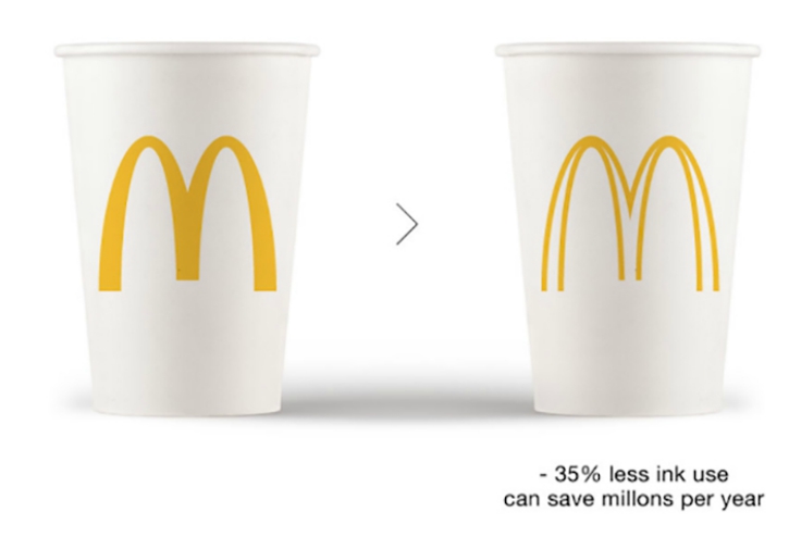
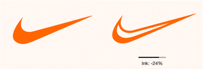
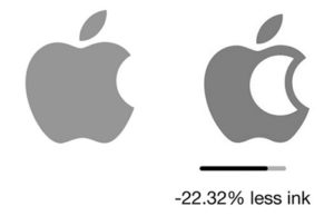
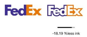
If the route of ecological revamp is chosen and logos are streamlined, businesses can emerge successful. Take a look at these legendary logos and get inspired:
McDonald’s – Brilliantly optimized, the remodeled McDonald’s logo uses 34.11% less ink.

Nike –Using 26.33% less ink, the Ecobranded Nike logo is certainly more eco-friendly.
Apple –The corporate makeover of Apple makes the logo leaner and greener using 22.32% less ink
FedEx –With 18.19% less ink, FedEx becomes environment friendly
All Image Credit: ECOBRANDING-DESIGN.COM
by admin | Oct 23, 2017 | Blog, Branding & Design
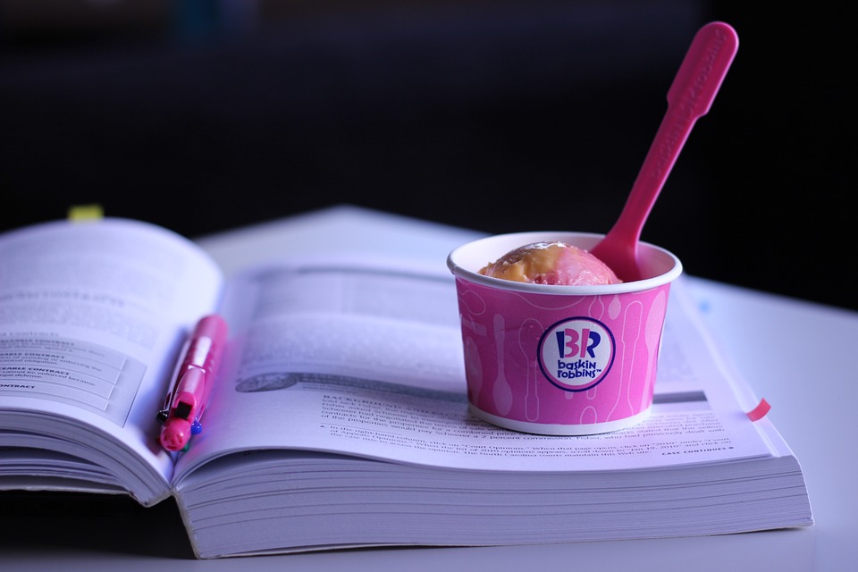
A well designed logo can be a major driving factor in a company’s success. Time and again we have seen that many business firms are able to develop a lasting impression in the minds of their customers with the help of their well designed logos. This is something that is certainly applicable for the American ice cream company Baskin Robbins. Based in Canton, Massachusetts and founded in 1945 by owners Irv Robbins and Burt Baskin in Glendale, California, the company currently serves to more than 3 million people all over the world on a weekly basis. The company has steadily grown over the years and has developed about 5800 registered outlets in a total of 43 countries worldwide.
 Ever since the company started its operations, Baskin Robbins has created more than 1000 flavors in all these years that have a lasting appeal on their extensive clientele. However, since the beginning, the company was known for its well known “31 flavors” slogan which left a permanent mark on its logo. The logo of Baskin Robbins is widely held to be one of the most popular, iconic and immediately recognizable logos ever created in the food industry. Over the years, the company redefined the look of its logo in a number of ways. However, certain aspects of the logo have remained the same even when new versions of the logo were created. For instance, the logo of Baskin Robbins mainly comprises of three different colors; pink, blue and white. The pink color symbolizes the pink spoon that is offered to the customers for tasting the samples. The distinct blue and white shades of the logo stand for qualities like elegance, excellence, purity and reliability.
The latest version of Baskin Robbins logo was implemented in 2007.(1) This new logo beautifully shows the number “31” that signifies the total number of flavors that are offered by the ice cream company. The number “31” appears in pink color between the names of “Baskin” and “Robbins”. Judging by the response of ice cream lovers all over the world, the new logo certainly has captured the imagination of millions of people. Just like Baskin Robbins, another business firm deserves special mention for it effective use of a highly creative logo and that is Amazon. Originally launched as an online bookstore, the first logo featured a large translucent A against a watery backdrop. This was further accompanied by the line, “Amazon.com; Earth’s biggest bookstore”.

Gradually as Amazon evolved into a major ecommerce portal that offered everything from books and music to other items, their logo changed into a new one that closely resembled the current logo. Soon, Amazon started working on its current logo which featured the words Amazon.com with the arrow that connects the A with the Z, denoting that everything from A to Z is available with the online shopping store(2). The arrow also creates a smile that indicates the satisfaction of the end users as they buy all of their necessities from the online store of Amazon.com.
Reference: 1
Reference: 2

by admin | Oct 22, 2017 | Blog, Branding & Design
The symbol for the Audi logo is the four ceiling rings representing the four original manufacturers of the Auto Union. The Audi emblem signifies association of the Audi brand with others: DKW, Horch and Wanderer. The first ring from the left side symbolizes Audi; the next ring represents DKW; Horch is represented by the third ring and the fourth ring signifies Wanderer. The similarity of the Audi logo to the official Olympic logo led World Olympic Committee to legally pursue Audi in the World Trademark Court. However, World Olympic Committee lost the case and Audi kept its official logo.
 The four rings that make up the official Audi logo symbolizes the four oldest automobile manufacturing companies in Germany that came together to create the new company in 1932. Prior to this, the motor vehicle manufacturers operated independently from one another. The companies Audi, DKW, Horch and Wanderer became the principal foundation pillars for the modern automobile firm of AUDI AG.
The logo was changed lately in 2009 in order to celebrate the 100th birthday of Audi. Certain minimal changes were made in the size, print, color and the common appearance of the logo. The logo is designed to sign the motto “Vorsprung durch Technik”, which actually means “Progress through Technologies”. The new logo makes use of a font that is more standardized and appears simple yet modern. Such a tweak in the appearance of the logo is meant to communicate a message from the makers of Audi cars to all the employees and customers about rendering more advanced, innovative and creative designs. Implemented in 2009, the new logo is considered to symbolize the whole car company and it also further reinforces its historic bond with the Audi’s customers.
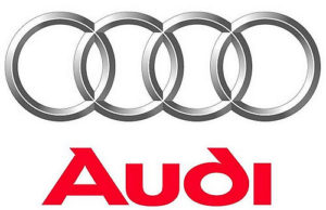 The logo of the Audi company includes four 3 dimensional overlapping rings which nowadays look more sharp-cut and precise with the effective use of polished chromium look. Apart from signifying the merging of the four automobile companies Audi, DKW, Horch and Wanderer, it also represents strength and security. The logo is considered to be a symbol of power and protection, depicting the historic 1932 merging of Audi along with the three other noted car manufacturers. This new look of the Audi logo that was created in 2009 expresses the relentless and earnest efforts of the auto manufacturer to strengthen the ties with the clients as well as increase the loyalty, efficiency and ultimate superiority of the car brand.
The new Audi symbol has a darker coloration which gives it a highly defined, prominent and shiny look. The shade of aluminum in the rings perfectly portrays slight design and innovative power. The bottom competency of Audi certainly places the brand apart from all others. The bright and sleek look of the new logo adds a distinct touch of sophistication to the cars. The new font used in the logo gives an impression of high efficiency. It also provides with a sleek and innovative feel, which certainly goes well with Audi’s new design principles and technologies.
