
A well designed logo can be a major driving factor in a company’s success. Time and again we have seen that many business firms are able to develop a lasting impression in the minds of their customers with the help of their well designed logos. This is something that is certainly applicable for the American ice cream company Baskin Robbins. Based in Canton, Massachusetts and founded in 1945 by owners Irv Robbins and Burt Baskin in Glendale, California, the company currently serves to more than 3 million people all over the world on a weekly basis. The company has steadily grown over the years and has developed about 5800 registered outlets in a total of 43 countries worldwide.
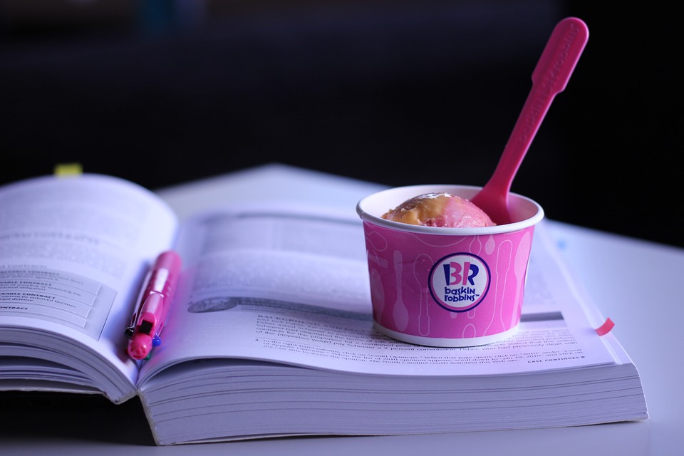
 Ever since the company started its operations, Baskin Robbins has created more than 1000 flavors in all these years that have a lasting appeal on their extensive clientele. However, since the beginning, the company was known for its well known “31 flavors” slogan which left a permanent mark on its logo. The logo of Baskin Robbins is widely held to be one of the most popular, iconic and immediately recognizable logos ever created in the food industry. Over the years, the company redefined the look of its logo in a number of ways. However, certain aspects of the logo have remained the same even when new versions of the logo were created. For instance, the logo of Baskin Robbins mainly comprises of three different colors; pink, blue and white. The pink color symbolizes the pink spoon that is offered to the customers for tasting the samples. The distinct blue and white shades of the logo stand for qualities like elegance, excellence, purity and reliability.
The latest version of Baskin Robbins logo was implemented in 2007.(1) This new logo beautifully shows the number “31” that signifies the total number of flavors that are offered by the ice cream company. The number “31” appears in pink color between the names of “Baskin” and “Robbins”. Judging by the response of ice cream lovers all over the world, the new logo certainly has captured the imagination of millions of people. Just like Baskin Robbins, another business firm deserves special mention for it effective use of a highly creative logo and that is Amazon. Originally launched as an online bookstore, the first logo featured a large translucent A against a watery backdrop. This was further accompanied by the line, “Amazon.com; Earth’s biggest bookstore”.
![]()
Gradually as Amazon evolved into a major ecommerce portal that offered everything from books and music to other items, their logo changed into a new one that closely resembled the current logo. Soon, Amazon started working on its current logo which featured the words Amazon.com with the arrow that connects the A with the Z, denoting that everything from A to Z is available with the online shopping store(2). The arrow also creates a smile that indicates the satisfaction of the end users as they buy all of their necessities from the online store of Amazon.com.